Project Summary
This was absolutely a passion project for me. I have collected toys/action figures for close to 20 years now, and some of my favorites pieces have been the creations of a small studio in New Jersey called Four Horsmen Studios. A few years ago this company began releasing a fantasy-themed series called "Mythic Legions" that immediately became my favorite toys to collect. I even started customizing these toys, creating a name for myself within this growing collector community.
Fast forward a few years to mid 2018 and I had a chance to visit the 4H studio as part of the "Intern for a Day" event. That event allowed me to begin talking to the owners of the studio who loved my custom work and my passion for their line. I was subsequently invited to return to the studio as part of their annual G-con online event to showcase my work in both 2018 and 2019, and at the 2019 event I began talking to the studio about their online presence. Once they became aware of my work as a web designer, they suggested that I may be able to help them improve their website and online content. Needless to say, I was honored to be asked to work on this project and super excited to get started!
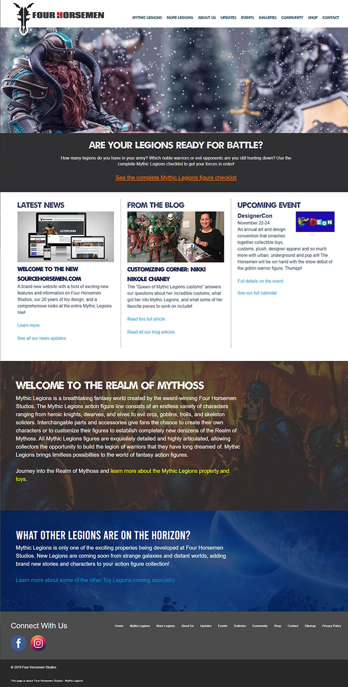
Most of the work I do I am able to approach as as professional web designer/developer, but for the Four Horsemen Studios website, I was also abel to tap into my love for their work and my opinions on what I would want to see as a fan. The end result was an expansive website detailing the company's popular Mythic Legions line and some of the other work they have done over the years. Even cooler, once the site was done, I was asked to work with the studio as their "Digital Marketing Manager", updating the website and authoring fresh content for Mythic Legions fans to enjoy.
My work on SourceHorsemen.com has absolutely been one of the most amazing projects I have had the pleasure to work on in my 20+ years as a web designer, and it has been incredible to be a small part of the awesome stuff coming out of this little toy design studio in New Jersey!